-
(单词翻译:双击或拖选)
If you're an obsessive1 designer, you might have seen a subtle tweak to Google's logo made over the weekend. If you're like the rest of the planet, you missed it.
如果你是个有强迫症的设计师,你可能会注意到谷歌logo在上周末做的细微调整。如果你是这个地球上的普通人,你可能就会错过这个小改变了。
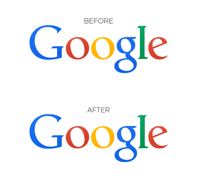
Before we reveal what's new, we'll give you a chance to try to spot the difference. Here is the old logo:
在给大家展示新logo之前,我们先给大家个机会来找找区别。旧logo长这样:
And here is the new logo:
新logo长这样:
See anything different? The change made was a tiny shift in kerning -- or, the space between two letters -- of the "g" and "l," moving the "g" one pixel to the right and the "l" one pixel down and to the right.
看到不同吗?其实是对字母“g” 和“l” 之间的字距进行了很细微的调整。字母“g” 向右移动了一个像素,字母“l” 向右下方移动了一个像素。
The subtle difference supposedly makes the overall logo more pleasant on the eyes and easier to read.
如此细微的调整据说是为了使整个logo的可视性更好,更容易看清楚。
Redditors spotted2 the change a few days ago, and a Google representative confirmed the tweak to The Huffington Post, saying, "Great to see people notice and appreciate even single-pixel changes -- we tweaked the logo a little while ago to make sure it looks its sharpest regardless of your screen resolution."
社交新闻网站红迪网上的网友几天前注意到了这个改变,一位谷歌的发言人也对《赫芬顿邮报》证实了这一logo优化,该发言人表示:“很高兴有人注意到并认同哪怕是只有一个像素的调整,我们前不久对logo进行了改进,主要是为了确保不管你的屏幕分辨率如何,我们的logo看上去都是最清晰的。”
Here's a GIF that shows the change from old to new, for those of us who aren't kerning-obsessed:
送上一个新旧logo的动图,给和我们一样没有字间距强迫症的普通人:

图片1
 收听单词发音
1
obsessive

|
|
| adj. 着迷的, 强迫性的, 分神的 | |
参考例句: |
|
|
|
2
spotted

|
|
| adj.有斑点的,斑纹的,弄污了的 | |
参考例句: |
|
|
|


